On-demand services have been around since before the pandemic.
It didn’t pull our attention towards their services until we, too, were stuck at home under lockdown and certainly most of these apps have been our savior in the pandemic.
Their importance didn’t suddenly rise, they just came more in the spotlight.
The ones that attracted our attention quickly were those with fantastic User Experience or UX Designs for on-demand app services.
In the post-pandemic lifestyle, we have all adopted on-demand services regularly.
According to Statista.com, on-demand users spend $57.6 billion annually, of which 35.5 billion goes to the online marketplace alone.
Now you can take advantage of this traffic. How?
Build an on-demand mobile application. It is where the hardships begin. It gets technical.
Welcome To The World Of UX Designs
UX designs help you stand out in a flooded marketplace and give your app a unique spin while working with the same basic workflow.
We will not talk about its value but jump straight into showing it.
How to Step-by-Step UX Design for On-Demand Apps
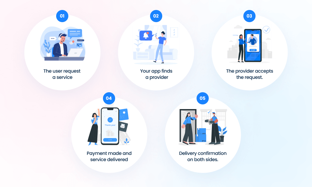
The flow of UX designs for on-demand apps, irrespective of category or industry, is pretty similar. Are you familiar with the basic workflow of UX designs for on-demand applications?

- The user request a service.
- Your app finds a provider.
- The provider accepts the request.
- Payment made and service delivered.
- Delivery confirmation on both sides.
Then comes rating, which defines the efficiency of the service or business primarily on delivery time, quality of the service or product, and customer service etc.
Applause to you, my friend! You have achieved half your goal. If you can follow the above structure, it will be easy for your user to navigate your app, and yet you manage to stand out with your UX design.
Guide for UX designs for On-demand Apps
All on-demand applications start at customers’ fingertips and end at service rating. The process in between is what keeps the user coming back. The goal is to provide value. Here are some UX design guidelines for on-demand apps.
Research Comes First
Research is the first stepping stone for every business, service, application, or anything else. The same goes for your UX design. Research goes a long way in guiding UX design for on-demand apps.
- You should start by analyzing the market for the service the app will provide.
- Consider age demographic, geographical location, and all the customer preferences that affect the app's usage.
- Take help from targeted surveys.
- Knowing what works for all the competitors in your market, by industry or service, can answer many consumer questions for your UX design.
- You should also delve into some non-competitor research for varied design options, inspiration, etc.
Paint a picture for color, flow, options, and best features. It gives an outline of the UX design. You will know what you like, what you want, and what your user will want.
Design to Flow
Now we move into physical work, the first part of physical work. The picture you have painted in your head, how does it look on paper? On the system?
Is it the right balance between practical and amazing? Will it make your user fall in love while providing value? Brainstorm and start giving it shape.
- Remember the finer points that can make the UX design stand out while meeting user requirements.
- What can be done differently while keeping the basic understanding and in-app navigation simpler?
- Your on-demand application’s priority should always be the user’s ease. Everything else comes second.
- Figure out the Color, UI, positioning, features to include, navigation, timelines, or more.
- Segregate and mark redundant sections to automate things for the user.
UX designs’ minute user-relevant features set the on-demand application apart.
Friendly Features
All on-demand apps have basic features like time tracking, scheduling, and payment methods, making the user experience more accessible. Fine-tune this for a specific audience.
- Personalized tracking is a valuable feature for the courier, cab, and delivery services like food or medicine.
- For niche audiences like travelers and streamers, categories and sub-categories in vast detail is a good idea.
- Video friendliness and pop-ups that allow all users, interested and uninterested, to do as they wish with them is a plus.
Keep things exciting and engaging when considering updates and glitches to soothe the user. Give them details of the process for them to have a better understanding of how it is going to benefit them or how it's going to be solved.
Customer Care
The behavior of the delivery personnel, the cab driver, or the person sitting on the opposite side of the phone at the call center is a part of the user experience. Still, they are out of the hands of a UX designer. So, focus on the details that UX can influence.
- Try to help a user get what they want in fewer steps. Multiple options at each stage are acceptable compared to numerous steps.
- Users are attracted to referrals, discounts, or in-app mini-games. It makes for an entertaining incentive.
- If compatible, try to incorporate an FAQ or interactive AI option to solve problems without waiting in the line for a call center executive to pick up.
Customer care is more than human interaction. It is the ease of use, the benefits, the needs met, and problems solved.
Conclusion
On-Demand services and apps have been in the market before their boom during the pandemic. With each newer on-demand service or business in the market, their corresponding applications have been acing the UX goals.
We, too, go above and beyond with every UX design for on-demand app services. Think market understanding against the app's value and consider the ease of use and shorter time intervals.
What can you do to provide value to the customer or user above and beyond what is already in the market? The answer to that question will create a unique UX design for your on-demand application.

